
Springtime in Los Angeles is filled with smells both wonderful and nauseating. I run by them frequently.

Art Blog
Stories about making things out of nothing.
Viewing entries tagged
2
It's been a while since I've done a Photoshop drawing for my Sketchbook. I'm starting to get back into the practice.
These poses were a lot of fun to draw. I think I'll sketch more dancers. Dancing is a great subject for practicing human figure stylization. This one has been added to my digital sketchbook.
I simply enjoy drawing people from another era. You'll see the evidence in my sketchbook.
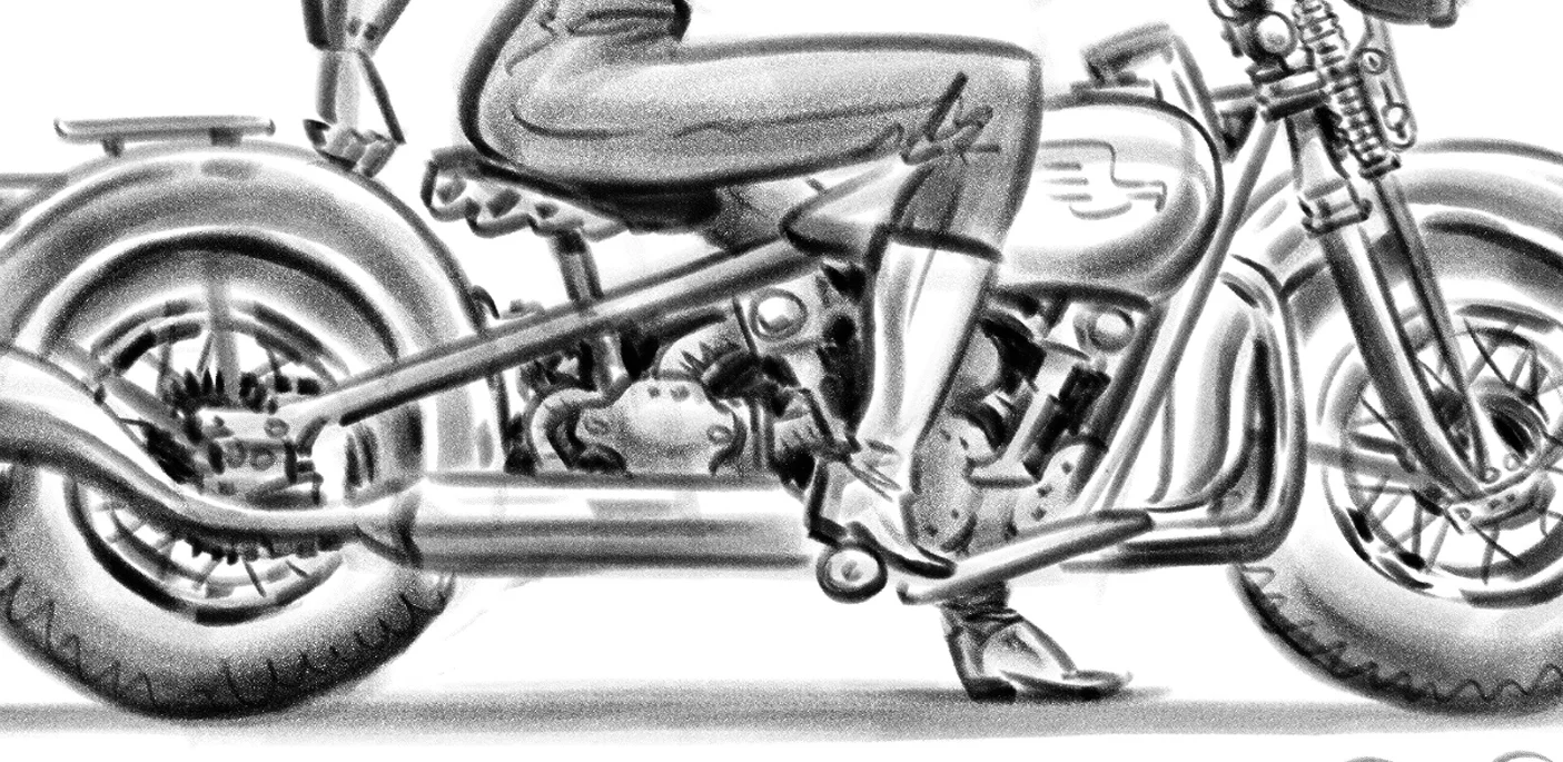
What started as a little warmup sketch became a more involved drawing that took about a half hour. Note to self: don't choose to draw a motorcycle with detail when you just want to draw something quick.
This drawing has been added to my digital sketchbook.
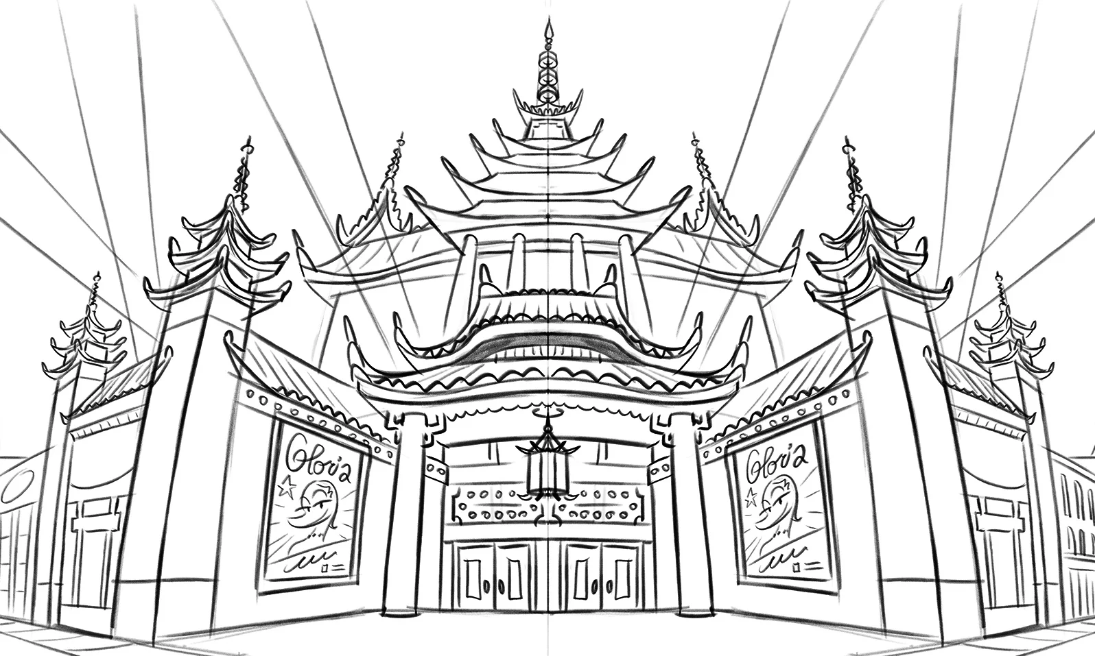
Since these concept drawings were scrapped from the project, I'm going to show them off. They were part of animation storyboard for virtual reality. Y'know, the technology where you wear screens over your eyes and you feel like you're someplace else.
These location drawings are distorted with multiple perspectives to emulate the experience of looking around inside the virtual reality world. It was fun to work with the challenge of a technology I hadn't worked on before. The storyboard itself focused on the character action and not the framing of the scene, since what the viewer sees is up to them. That's why these backgrounds have no sense of cinematic composition.
I did this drawing to practice rendering more tightly with digital pencil, yet maintain a sketchy, hatched line. It took a long time to finesse the shading and I think a less polished style gets a similar look for much less work. But the point of technique experimentation is to find a mix of comfort zones and boundary pushing. I learned a lot with this one.
I'm quite happy with the final result, especially the character stylization and composition of dark and light shapes. I posted this drawing to my sketchbook gallery.
The rough sketch.
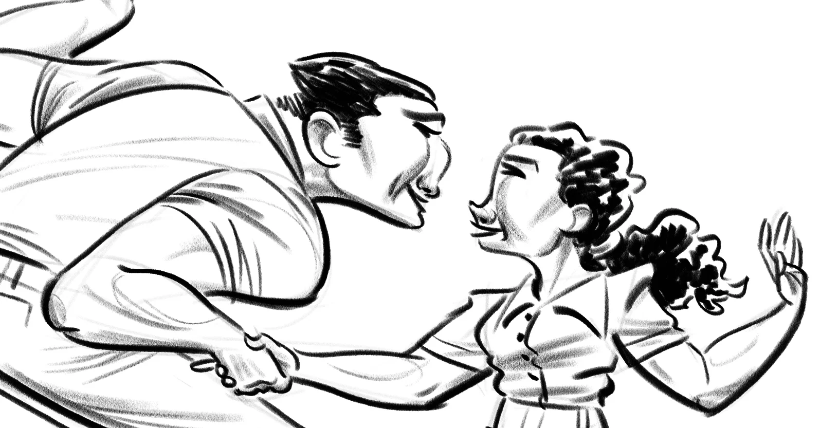
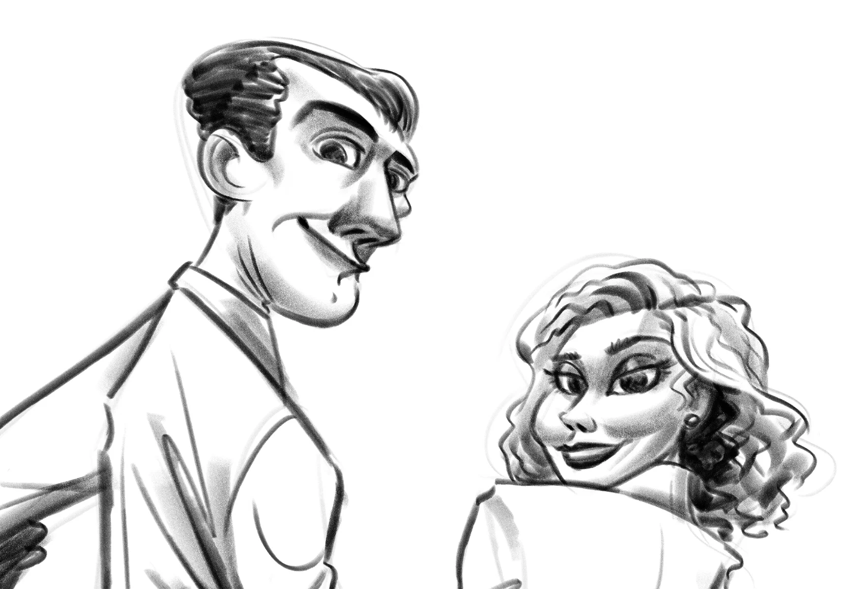
I've been sketching a lot of people lately but most have been of a single person not doing much. I want to step it up a notch with more than one person. Character interaction means at least something is going on... like, say, walking arm in arm.
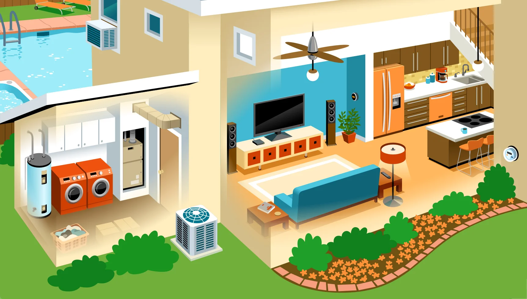
This piece was commissioned by a company called Simple Energy that helps consumers track their home energy usage. For publication on the web, it is an interactive illustration with parts that when clicked, display more information about that element. In order to design this functionality, the illustration has 2 views: a grayscale version with the clickable parts in color, and the full color piece.
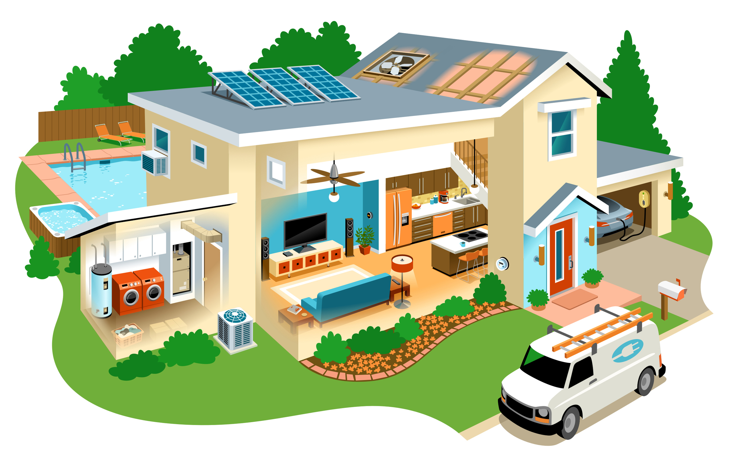
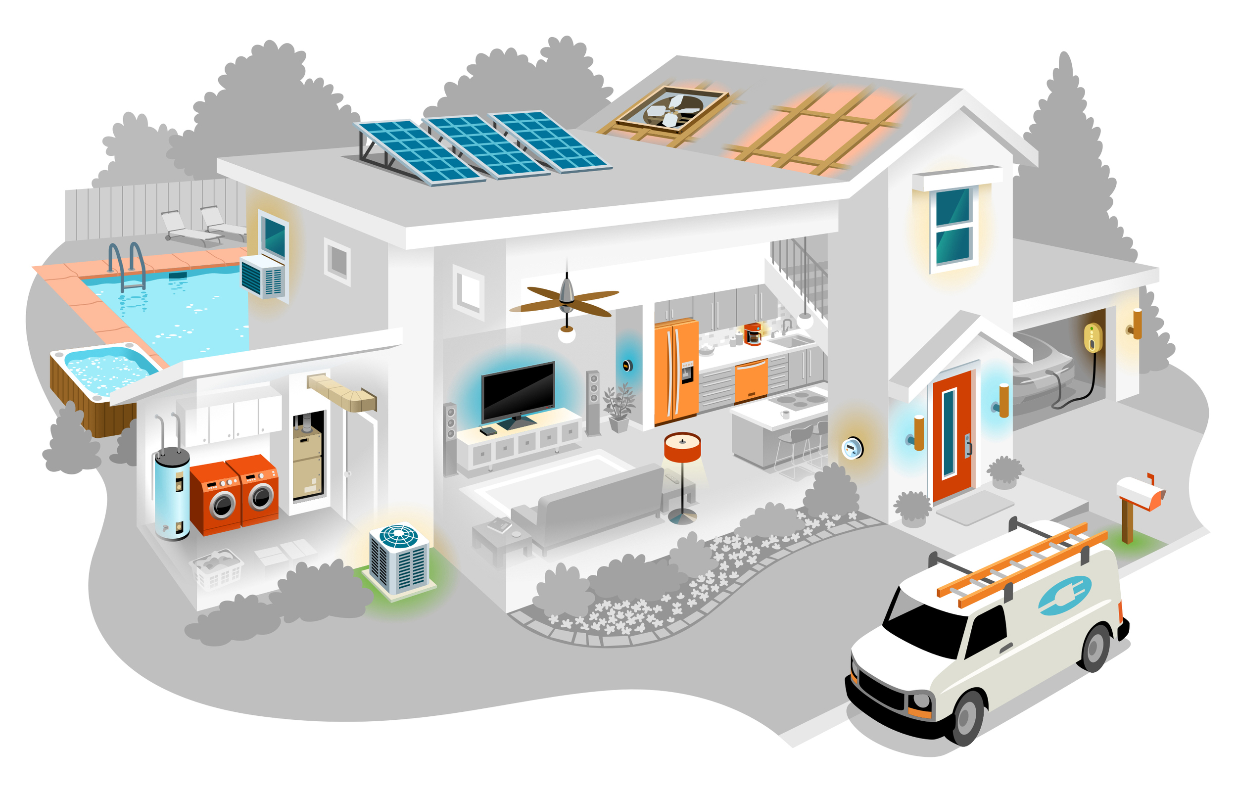
It was complex to design and took a lot of planning for the details to work right. Sections like utilities and entertainment needed to be visually grouped. Small elements had to be made big enough to be clickable. Large elements like the van and pool couldn't be too attention grabbing. I didn't want buttons or other graphics to mess with the artwork which is why color is used to signify where to click when the cursor hovers over it.
I kept the palette simple as not to overly clutter the piece and give it a modern feeling. But I also wanted it to be warm and inviting. It turned out quite slick. While I've illustrated a lot of architecture, the new challenges of this interactive piece made it an exciting project.
The details up close. Click to enlarge.
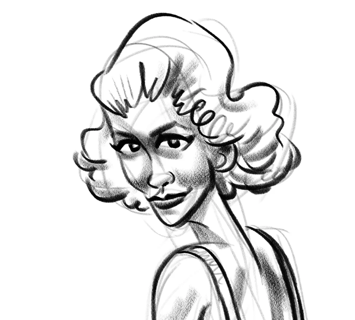
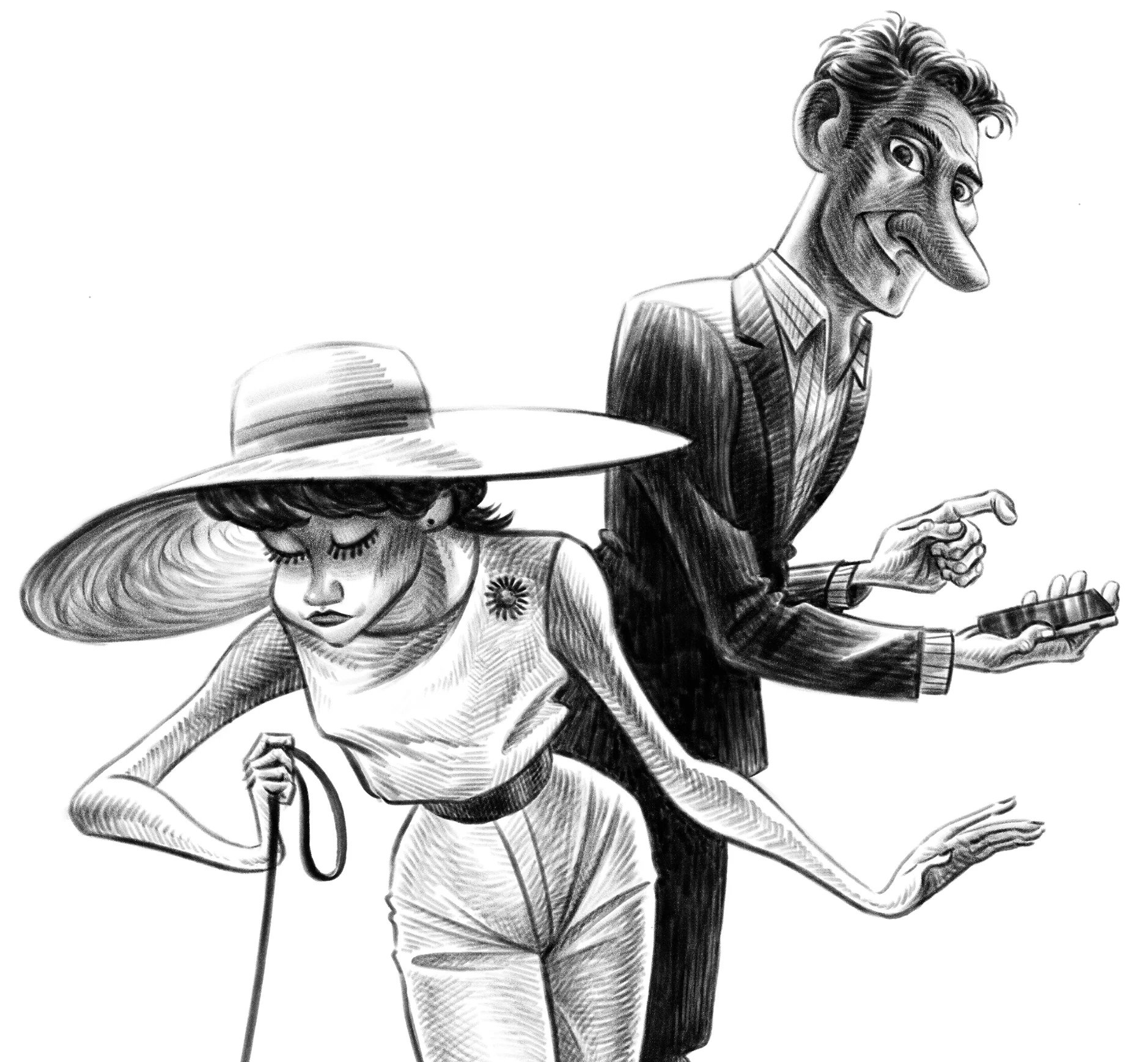
Someone I follow on Twitter posted a clip of the 1980s hit show, Moonlighting. The nostalgia hit me! I watched the show as a young teen but didn't remember just how striking Cybill Shepherd was. Enter inspiration. This was drawn in Photoshop and is posted in my sketchbook.