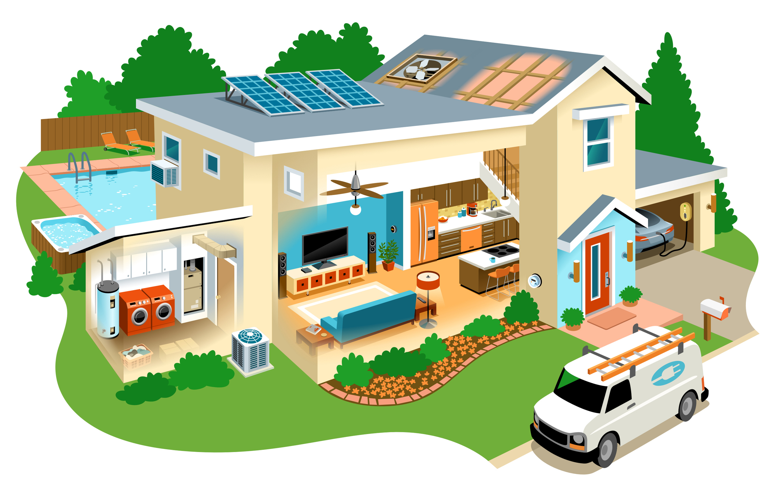
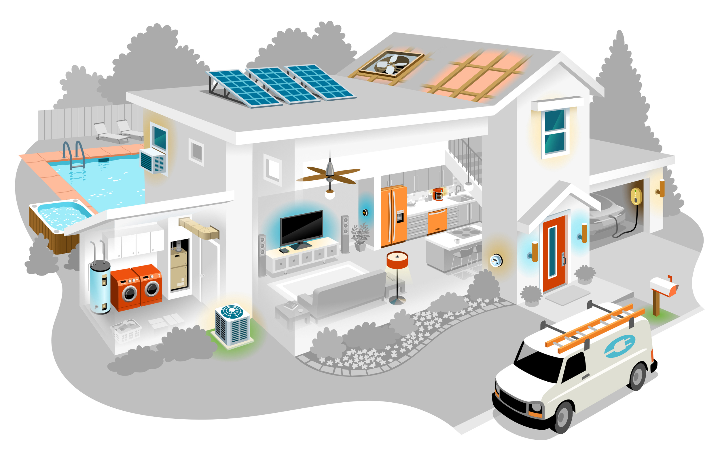
This piece was commissioned by a company called Simple Energy that helps consumers track their home energy usage. For publication on the web, it is an interactive illustration with parts that when clicked, display more information about that element. In order to design this functionality, the illustration has 2 views: a grayscale version with the clickable parts in color, and the full color piece.
It was complex to design and took a lot of planning for the details to work right. Sections like utilities and entertainment needed to be visually grouped. Small elements had to be made big enough to be clickable. Large elements like the van and pool couldn't be too attention grabbing. I didn't want buttons or other graphics to mess with the artwork which is why color is used to signify where to click when the cursor hovers over it.
I kept the palette simple as not to overly clutter the piece and give it a modern feeling. But I also wanted it to be warm and inviting. It turned out quite slick. While I've illustrated a lot of architecture, the new challenges of this interactive piece made it an exciting project.
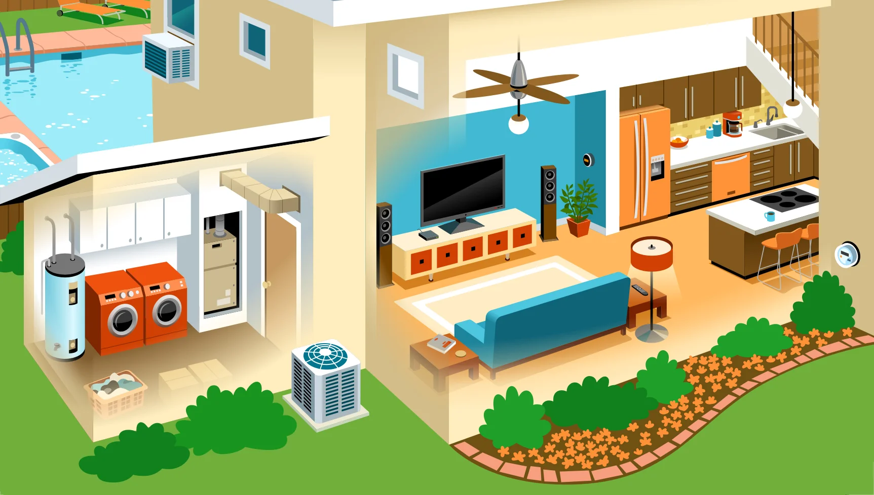
The details up close. Click to enlarge.


