
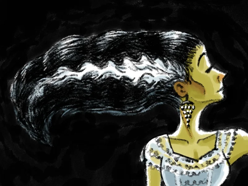
I'm getting into the Halloween spirit with this drawing of the famous horror bride. The piece was drawn for fun to practice with some new digital brushes and textures.
Art Blog
Stories about making things out of nothing.
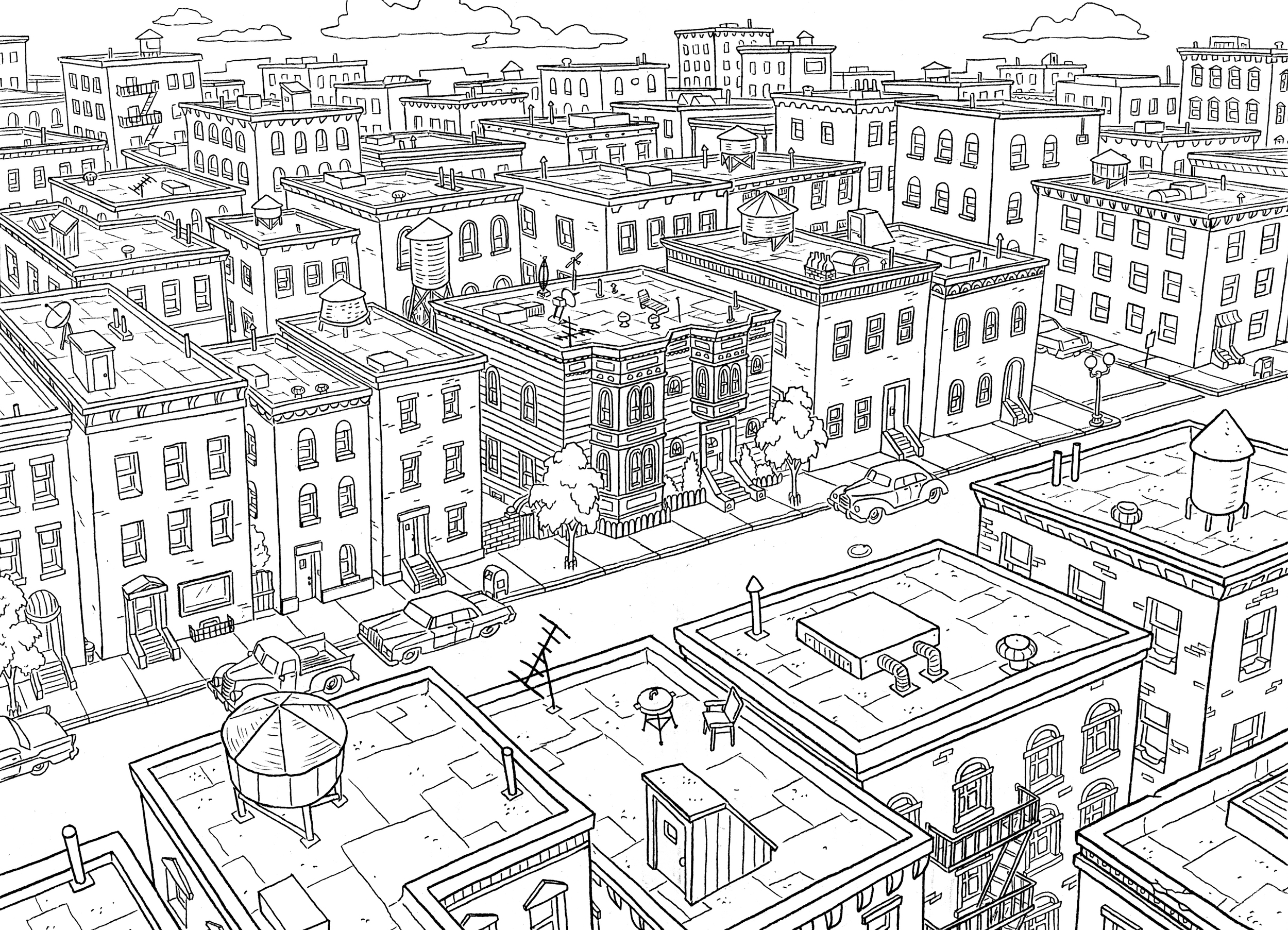
Layouts are drawn from storyboards which define the action and perspective in the scene. Because storyboard artists draw backgrounds in a rough, simplified style, background layout artists take them to the next level by defining the detail and perspective. Layout drawings are then given to the background painters to color and complete the visual style.
Depending upon the style of the film or show, the lines of the layout drawings may be visible in the finished background that is used in a final production. Or the visual style may be void of line work, thus the layouts serve as a guide for the painters.
The line work will be part of the finished background.
Depending upon the production, background layout artists also do background design. This is standard in television animation, which is my field, and the position is often titled background designer. The designer must envision new locations when they are called for in a script, taking into account the action of the characters and the mood of the scene. The design drawings are given to the storyboard artists to show them what a place looks like.
A design drawing to establish a new location. The rain is animated and would not be part of the final background layout, but is drawn here for mood.
I often get asked what I do in animation since people outside of the industry are unfamiliar with the process. It's a lot more fun than this dry explanation of the job. A lot of creativity goes into making places that are believable in the world of the characters.
Most importantly, backgrounds must support the narrative of the story. Designers take into account things like the personal style of characters or the economic state of imaginary neighborhoods. They draw places that have history, like showing what has happened previously in a location, even if we never saw it happen, or the history of a place long before the characters existed. Even when imaginations dream up incredible fantasy worlds, places often have facets that make them relatable to our everyday world.
Left: My layout drawing. Right: The finished painted background with characters and effects.
2015 Update: As my career shifts, I've been doing more storyboarding than background design.
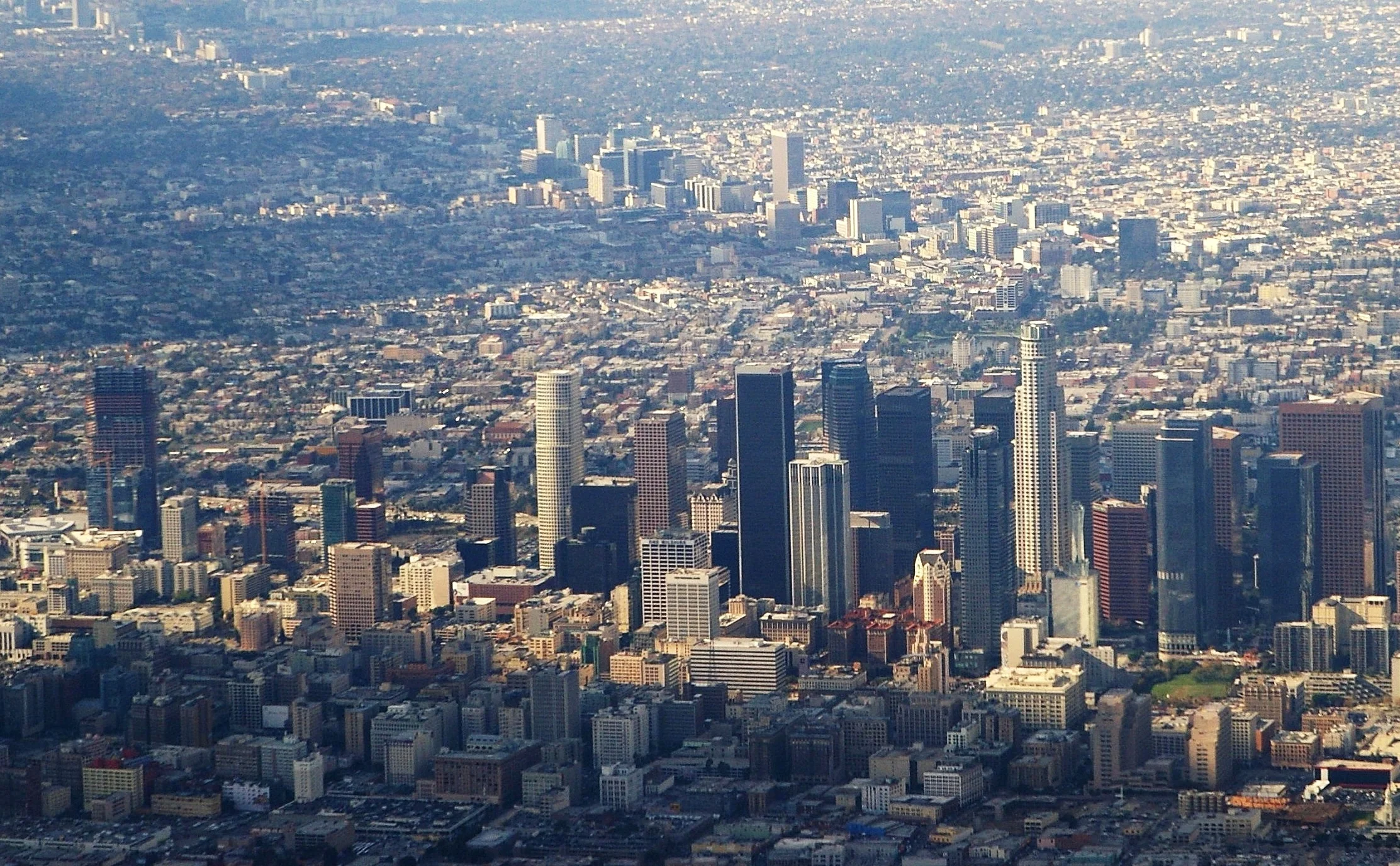
The last dozen years of my illustration career does not quite reflect my talent for cartooning. My portfolio is rife with artwork of scenery and architecture. But I am a cartoonist. Upon graduating art school in the 1990s, I entered the field of animation at Nickelodeon Animation Studios in Los Angeles where I became a background designer and storyboard artist.


I loved animation work. I thrived in a highly creative industry with many talented artists around me. It's fun to work on shows that are enjoyed by millions of people. But with that, I had to live in Los Angeles. It's not that I disliked the city, rather I longed for a different lifestyle. After seven years in LA, I moved to Boulder, Colorado where I built a prolific freelance illustration career.
In Colorado, I hiked and snowboarded. I became a homeowner thrice. I drove my 1967 Jeep in snowstorms and a sidecar motorcycle in the summer with my dog. I lived in town and in the mountains. I survived a flood. I raised money for Colorado's fire and flood relief with my art. I created hundreds of artworks. I started businesses to both success and failure. I got married on a mountain patio in winter. My wife and I had a son. I made lifelong friends. Colorado was good to me for a over twelve years.

The deck of our Colorado home.

Our new LA home.
Last week, I returned to California, this time with my family.
I never left animation because I didn't like the work. In fact, I've missed it through the years. I am actively looking for work as a storyboard artist or background designer in television animation. Stepping away from animation made me I realize how much passion I have for cartooning and storytelling. As good as I am at illustrating landmarks, I'm better at telling stories through art.
This piece was commissioned by a real estate agent as a closing gift for a couple who has lived in this home for over forty years. I was not present when the gift was given, but the artwork moved them to tears. While I enjoy illustrating for companies, creating art that is deeply meaningful to someone is one of the greatest joys of doing home portraits.
Click to enlarge.
I was commissioned by New York company, OrdrUs, to create a series of illustrations to help sell their service to restaurants. They provide online and mobile takeout ordering.
After doing a series of slick, colorful illustrations, they decided to scratch those for a different approach. I developed this rough line and watercolor style to supports their non-technical approach to selling their technology.
These were all created on my iPad with the Procreate app and a Jot Touch pressure sensitive stylus. I've been doing more professional illustration on the iPad lately.
I do warmup sketches at the beginning of the day to get my creativity flowing before starting client work. I used to do it about once a week but I'm trying to do it more consistently. Here are the sketches that got my day going this week.
These illustrations were created for a startup that built an app for restaurant owners. However, the company chose not to use these illustrations after all. It doesn't happen often, but sometimes my art never reaches its intended purpose. But don't worry, I've been creating different illustrations for the same company in a visual style more suitable to their audience.


See more website art in the illustration gallery.
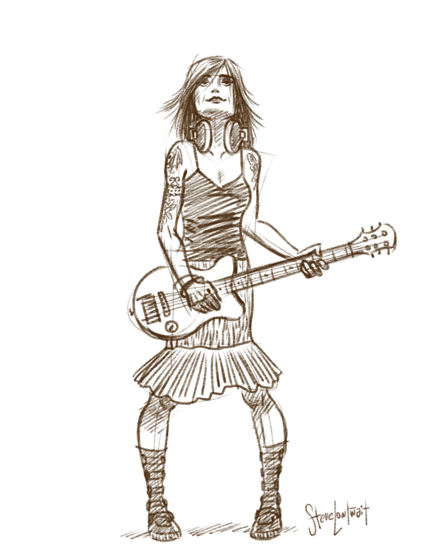
Here is my take on a modern version of the oh so cruel Cruella. I haven't participated in Sketch Dailies on Twitter in several months but I was seduced back by villain week. Evil is fun to draw.
Drawn on my iPad with the Procreate app and a Jot Touch stylus.
Gallerie Rouge is an upscale gallery in Denver that specializes in vintage poster art. I've sold some of my Colorado posters there over the years. I was commissioned to do this poster as a centerpiece of promotion for their annual show that focuses on outdoor themed travel posters.
I'll be signing these limited edition posters at the opening reception. Stop by to say hello and view the great vintage posters.
Friday, June 13, 2014
5:00-10:00 pm
Gallerie Rouge
2830 E 3rd Ave.
Denver, CO 80206
This art was illustrated on my iPad using the Procreate app and a Jot Touch stylus... y'know, to capture that authentic vintage style.
Having personally experienced the 2013 Colorado flood, this was a commission I could not pass up. The town of Lyons along the foothills of the Rockies suffered catastrophic damage from the flood. With damage in the millions of dollars, the community needs ongoing funds to rebuild. I created this poster as an image that the community can rally around in their restoration efforts.
Posters, t-shirts, and water bottles with the art are being sold as a fundraiser. The art has also been made into banners to line the streets of downtown Lyons. It warms my heart that my art can help a community in their time of need.
See all of my disaster relief posters here.


As an illustrator, I feel it's important to explore different paths of my creativity. It's how I grow as an artist and what keeps me inspired. While I enjoy working in a variety of aesthetics, I must balance that desire with clients that commission me for the style they know I do. Every so often, I take a chance.
Illustrated using the drawing app, Sketch.
The 2014 Bolder Boulder poster is a new visual style combining angular shapes inspired by Art Deco design with complex color gradients made possible by digital illustration tools.
The shapes of the runners were meticulously crafted with stark, straight lines, yet maintain the organic movement of their stride. Trees, of which I usually illustrate with silhouettes, are built with elaborate flowing shapes to give them depth and light. And the Flatirons, of which I've drawn over 40 times, take on a look I've not done before.
This is a style I'd been longing to explore for a while, and the Bolder Boulder poster was the perfect project for it. I used to utilize color gradients very sparingly but in this piece, nearly every shape has a noticeable gradient. Despite its freshness, the poster still falls comfortably into my body of work.
Last year, I tried something new by creating the 2013 race poster on my iPad. The tool of creation was different but the style was more typical of my portfolio.
I may not be running the race, but this year I broke a new record with the Bolder Boulder. I plan to create more artwork in this style and get better at it.
Purchase this poster here.